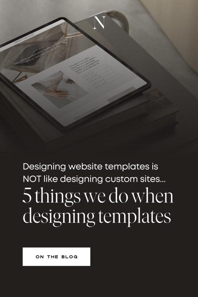

Let’s lay it all out on the table… designing Showit website templates is NOT just like designing a custom site.
Yeah we know, a dozen designers in a Facebook group have all told you it’s as easy as generating a share key and dropping that baby on Etsy. This is really bad advice. There are a lot of extra steps that going into designing, building and selling Showit website templates. Enough that we have built an entire program around it for Showit designers, Revolving Revenue.
We get it! You’ve got skillsssss! And you’ve been breaking that 6-figure ceiling with your template customizations and custom projects. YOU know what you’re doing. But WE know templates. Our business has been exclusively templates for over a decade and we’ve picked up a few tricks here and there. While these tips are standard practice to our Revolving Revenue members, you might find a few useful as well.
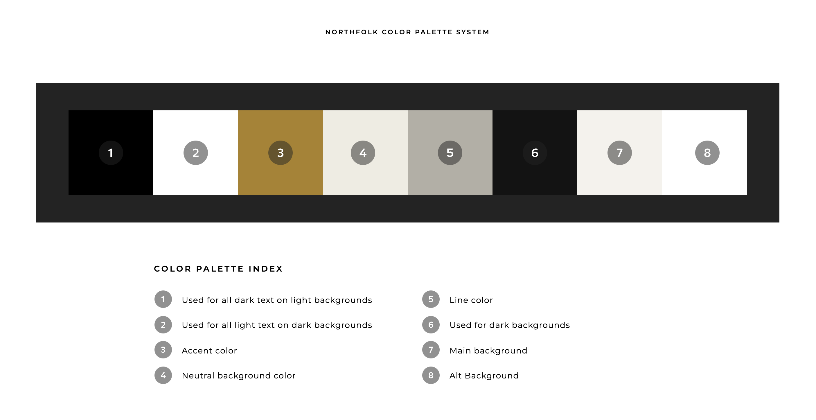
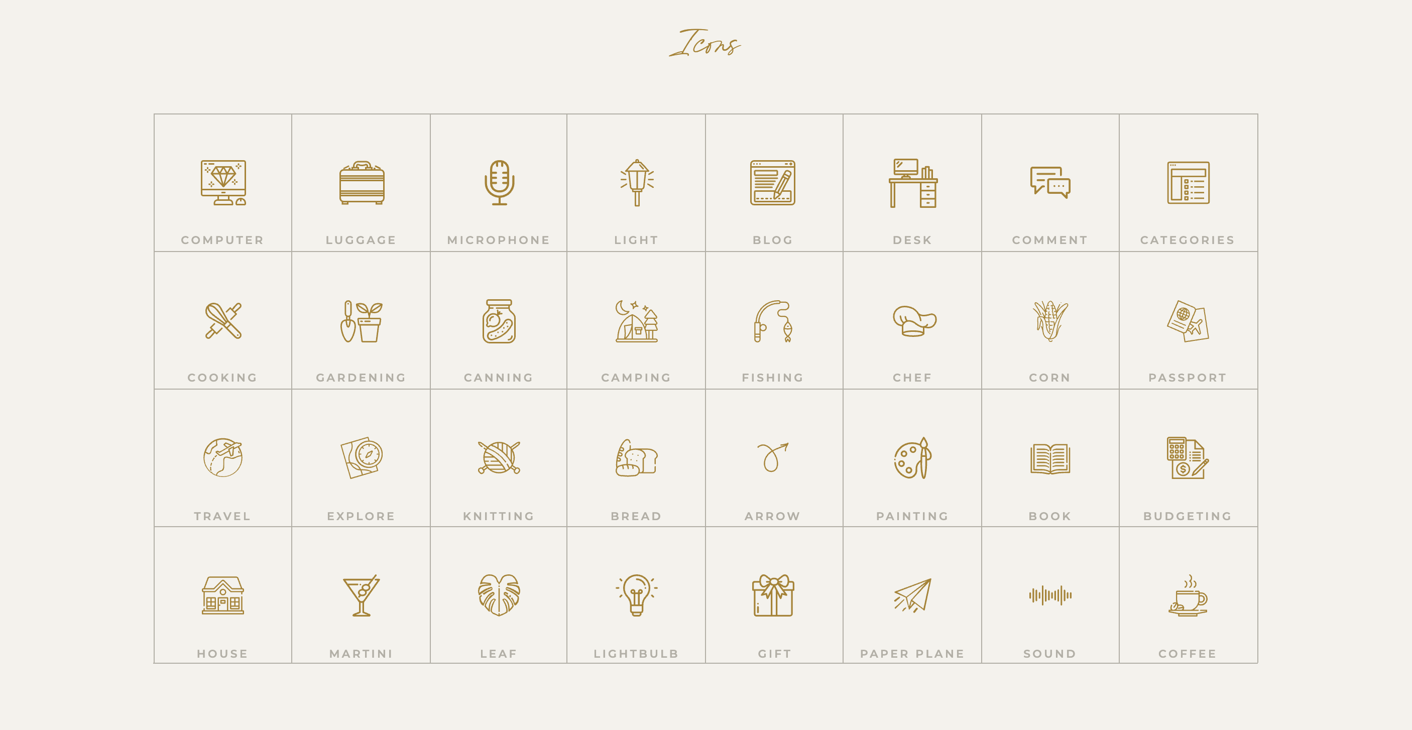
01 – Create a built in brand guide
This is a feature that has recently become popular in the design community, cause you know – designers customizing other designers templates is a likely source of inspiration. But we’ve been building brand guides right into our templates for as long as I can remember. Think of this like a quick style guide for your template and add any branding elements your client might need for their site. We build in brand guides to our templates so the end user has a quick way to reference the design elements of their site, swipe extra icons and access any fonts they might want to use outside of Showit.
💡 This is also a great spot to use affiliate links for things like fonts.
Things to include
- Font styles as they are designed, links to where they can download for free or where they can purchase and any additional custom licensing information
- Color palettes and how they are being used
- We love including extra style icons for different niches, making it easy for the user to swap them out
- Button styles to easily duplicate
- Include margin guidelines, for more complex designs, making it easier for the user to customize their site
- Extra elements and graphics used throughout the site
👉🏻 View the Saveur Brand Guide in action!
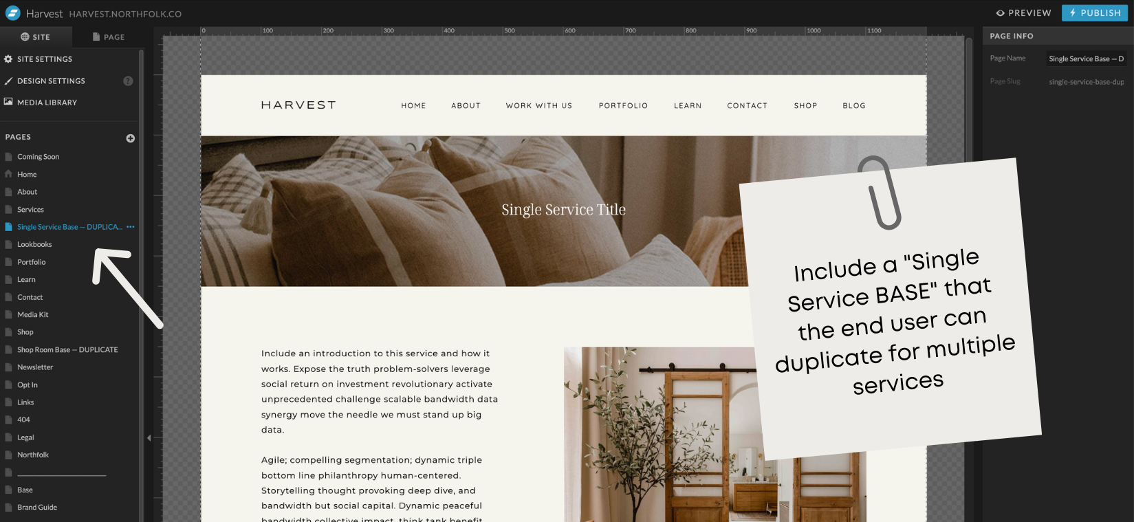
02 – Create a single service or other pages that can be duplicated over and over again
So many templates build out their service pages to showcase multiple offers & packages – all on one page. While this is great, what if the user wants to go into more detail about a specific service? And when you have a button that says LEARN MORE. Where is it linking to? Because every link should have a purpose and go somewhere.
We recommend building out a single service page that can be duplicated for any service. Not only does this help the end user to organize their offers, but its beneficial for their SEO as well.
💡 This strategy can also be used for any type of offer. We have done base pages for portfolio projects, case studies, and more.
Want to check out a few samples of how we do this in our Signature templates?
👉🏼 Avante – Single Service Page for Coaches
👉🏼 Harvest – Single Service Page for Interior Designers
👉🏼 High Tide – Single Service Page for Photographers
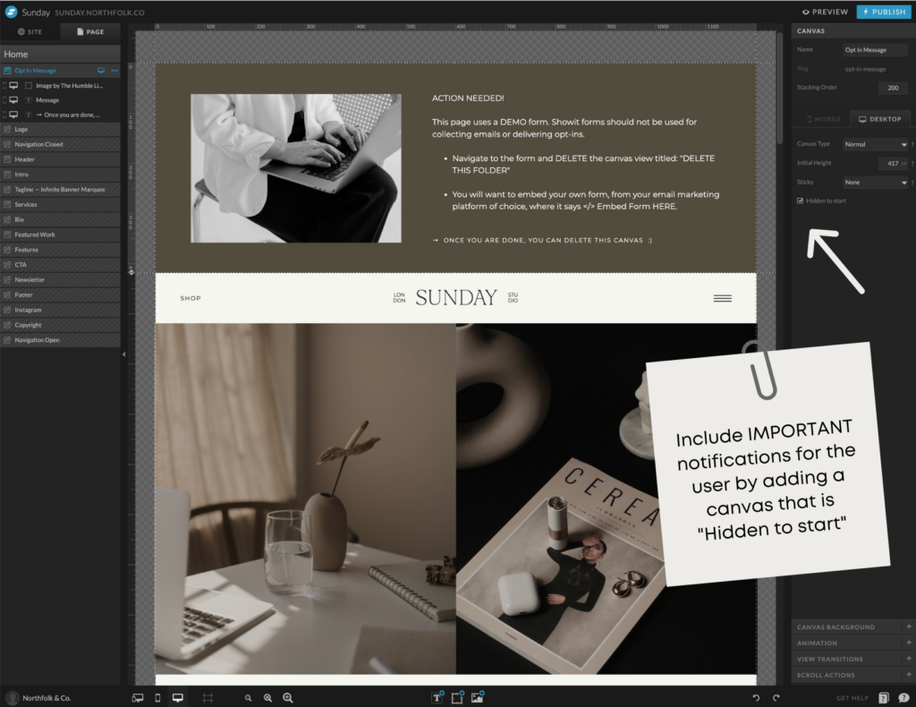
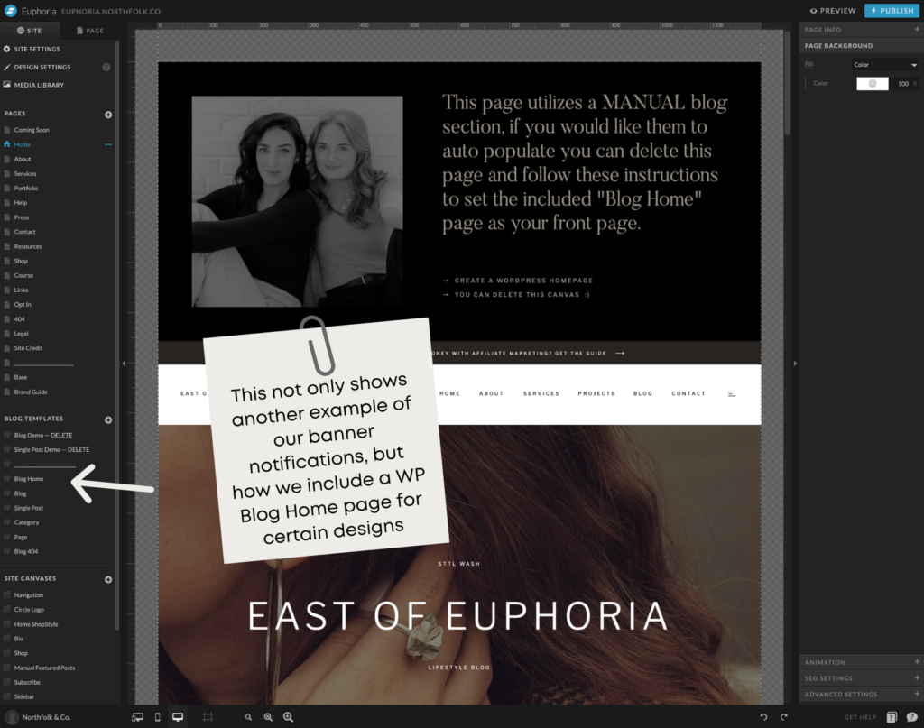
03 – Use hidden banners at the top of the page for important tips and instructions
If you steal any of our tips from this post, make it this one.
What is it
An instructional (think simple memo) canvas that is at the top of the page, and the first thing someone sees when they go to customize that page. You’ll want to make sure you check the “Hidden to Start” box so that this message only shows on the backend – not the front – and set all text elements to div. That way it won’t show on your demo and if the end user forgets to delete it (or doesn’t realize), it’s not showing on their site.
Why we do this
People are lazy. I said what I said. Okay in some cases, just busy. I get it, I really do! According to studies, only 25% of people actually read instructions.
It doesn’t matter that you spent hours slaving away on custom tutorials.
Or that Showit has the most EASY to search, extensive help center around.
Because people aren’t going there to look for it. They are diving right into your template and “winging it.”
So we decided for the really important things (like adding an opt-in form), we would put the memo right there at the top of the page where they can’t miss it.
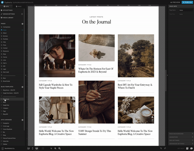
04 – When showcasing featured posts on your home page, include a WP version should the user want to automate their featured posts
This tip should be pretty standard, but you would be surprised at how many designers do not do this.
Fact is, if your template has blog posts anywhere other than the blog, the end user is going to automatically think that those posts should update themselves.
If you’ve been a Showit Design Partner for any amount of time, you know setting the pages up that way for a template doesn’t coincide with the Marketplace standards. Every once in awhile we get a client that wants full control over what is being featured anyways, so Showit pages work.
However, we always recommend building out your demo home page first (on Showit) and then converting it to a WP page, should the user want to auto-populate the additional blog sections. But like we always tell our RR peeps, “read the room.” If the template isn’t built for someone doing heavy blogging, the user might be more confused by the additional page options.
But if you’ve designed a template for someone that relies on blogging for their business, this extra page is a MUST.
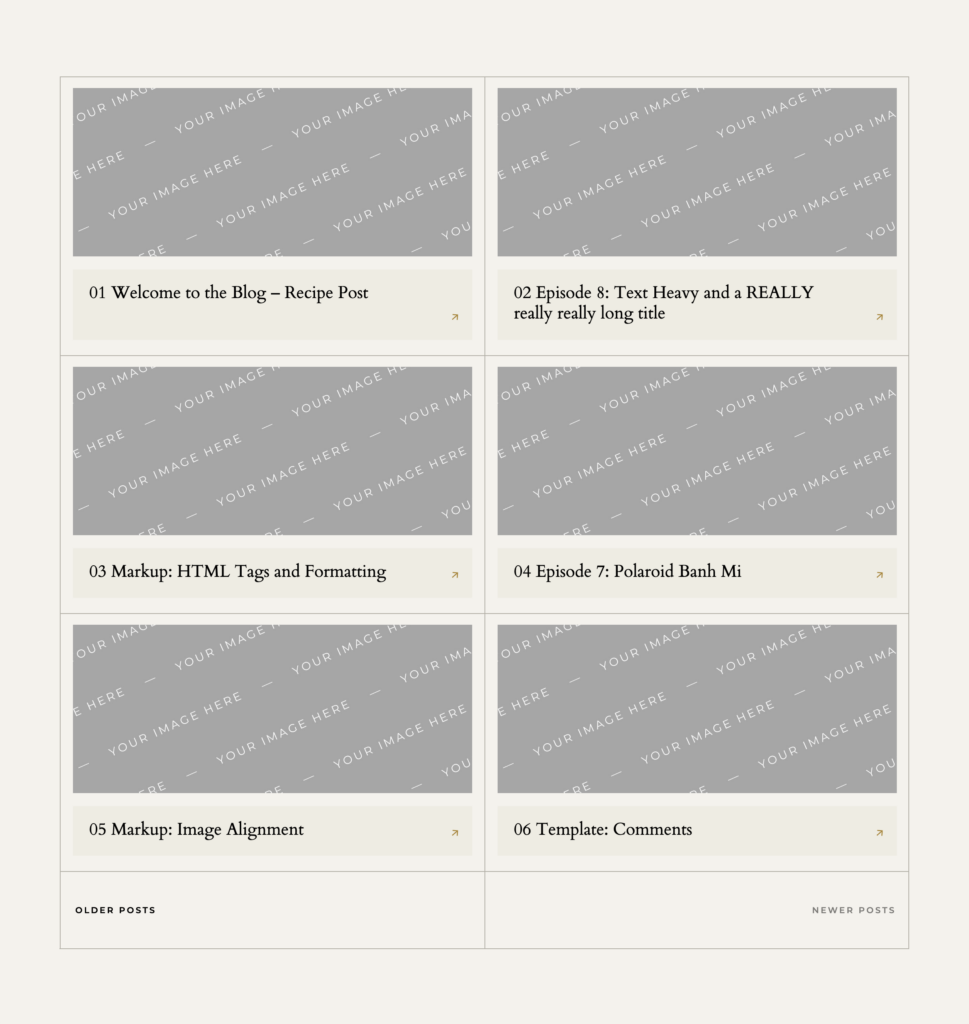
05 – Setup your test blog with numbered posts. This way, when you test your blog pages, it’s easy to confirm that your posts are setup and loading correctly
If you’re new to building templates, the first thing you need to do is take the Showit Design Market Standards Course. Upon completion, you’ll get your “Test Blog” that allows you to test out your templates before sharing them.
⚠️ Testing your blog pages is a very important step and one you should not skip.
But we (and by we, I mean Rachel, because I do NOT touch blog stuff) like to take things an “extra” step further. Rachel has created numbered posts as well as placeholder images so she can easily test our blogs and make sure things are in the correct order.
We have caught so many errors prior to sharing a design because of this trick.
We hope you enjoyed this little taste into the type of things we cover in our “Designing for Resale” lesson inside Revolving Revenue. Not only do our members get the in-depth trainings, but we also provide templates for just about everything you’ll need to get your template shop built and launched.
Did we surprise you with anything new? Head over to our Instagram post and let us know what you thought!
Resources:
- Learn more: northfolk.co
- Instagram: @northfolkco
- Course: Revolving Revenue
- Watch our 2 free lessons for sourcing template assets
Links:
- Join the convo: 5 tips when designing templates for resale
Pin this post for later!